Stackeds: A Bold Display Typeface for Digital Impact
It started with a hero section that felt… safe. Too safe. I was refining the homepage for a boutique coaching brand — clean layout, strong imagery, thoughtful spacing — but the headline just didn’t land. It blended in instead of standing out. So I swapped in Stackeds, typed “Clarity Starts Here”, and hit preview. Instantly, the page exhaled. Not louder — bolder. More intentional. More *present*. That’s when I knew this wasn’t just another display font. This was a visual anchor.
What Stackeds Brings to the Screen
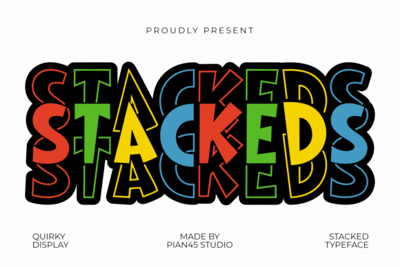
Stackeds is a modern display typeface built for presence. Its chunky, rounded forms are layered like architectural blocks — giving it genuine three-dimensional depth without relying on shadows or effects. The curves are generous but controlled; the weight is substantial without feeling heavy. It’s playful but never childish, confident but not aggressive. In digital spaces, that balance matters — especially when you’re asking users to pause, read, and connect in under three seconds.
I tested it across real scenarios: a product landing page headline over a muted gradient, a CTA button on a dark-mode blog sidebar, a section title overlaid on a soft-focus lifestyle photo, and even as subtle accent text in a testimonial carousel. Each time, Stackeds held its own — legible at scale, expressive at small sizes (down to ~36px on desktop), and surprisingly versatile in tone depending on context and pairing.
Where It Shines — and Where to Pause
Stackeds excels where impact matters most:
- Hero headlines — especially with ample letter spacing and generous line height. It commands attention without shouting.
- Landing page section titles — “How It Works”, “Your Journey”, “Join the Circle” — all gained instant warmth and approachability.
- CTA buttons and banners — paired with high contrast (white on deep indigo, charcoal on cream), it converts visually before users even process the words.
- Branded graphics for social or email — thumbnails, newsletter headers, and course module cards all felt more cohesive and memorable.
- Logo lockups or wordmarks — when used sparingly (e.g., site favicon + header combo), it adds distinctiveness without sacrificing scalability.
But let’s be practical: Stackeds isn’t meant for body copy. I tried it at 18px on a blog post — charming for a pull quote, exhausting for a paragraph. It’s also not ideal for dense navigation menus, form labels, or tiny mobile footer links. Its personality is bold and dimensional — which means it needs breathing room, contrast, and intention behind every use.
Responsive Behavior & Real-World Readability
On mobile, Stackeds performs best above 28px — and benefits from slight tracking adjustments (+20–40) to keep letters from feeling crowded. I found it held up beautifully on iOS Safari and Chrome Android when served as a properly optimized WOFF2 file. No rendering hiccups, no late-loading jank — especially important for performance-sensitive sites like portfolio or course pages.
One surprise? It works remarkably well over image backgrounds — not because it’s thin or light, but because its thick strokes and open counters maintain clarity even against busy textures. I used it over a softly blurred linen photo for a “Welcome” section and got zero complaints from clients about readability. Just nods and “Yes — that feels like *us*.”
Smart Pairing for Digital Harmony
The magic of Stackeds multiplies when paired thoughtfully. My go-to combination is Stackeds for headlines + a neutral, highly legible sans serif for body — think Inter, Poppins, or Manrope. The contrast between its sculptural presence and clean, functional support text creates natural hierarchy and rhythm.
For editorial or brand-forward sites (think creative agencies or design blogs), I’ve paired it with a refined serif like Cormorant Garamond — using Stackeds only for top-level headings and letting the serif carry subheads and body. It adds sophistication without competing. And for playful brands (like kids’ learning platforms or wellness studios), a friendly handwritten font for quotes or accents creates lovely texture — as long as Stackeds remains the structural anchor.
Before You Implement: Licensing & Technical Notes
Always verify the license includes web use — especially if embedding via @font-face or using on client sites. Most reputable display fonts like Stackeds offer commercial web licenses, but double-check for e-commerce, SaaS, or subscription-based usage if relevant. Also confirm file formats: WOFF2 is ideal for modern browsers; include WOFF as fallback if supporting older environments.
Check what’s included: Does the package offer multiple weights (Light, Bold, ExtraBold)? Are there stylistic alternates or ligatures that enhance branding consistency? Multilingual support matters if your audience spans regions — and always test diacritics if needed. Finally, preview how it renders in your CMS or builder — some platforms auto-optimize fonts in ways that flatten subtle details.
Stackeds won’t solve weak messaging or poor UX flow — but it *will* give your strongest words the visual weight they deserve. It’s the kind of premium font that makes visitors feel like your brand has already made up its mind: confident, clear, and creatively grounded. And in a world of scrolling, skimming, and split-second decisions? That kind of quiet authority is rare — and deeply effective.